 This post is currently down for maintenance.
For some time now I’ve been planning to add a Wordle graphic to the blog. The one below, set in a font called Enamel Brush, has at this writing just been slipped into the sidebar between my general and exhaustive lists of post labels.

Wordle is an online application created by Jonathan Feinberg. You enter a bunch of text into its box and it produces a nifty “word cloud” out of that, customizable in typeface, color, and (to an extent) layout, with the size of each word or phrase based on the frequency with which it appears in the source.
The bad news is that it doesn’t work quite as easily as I thought it was supposed to work.
I recently and somewhat randomly came across the poster below for the 1966
film Maya.
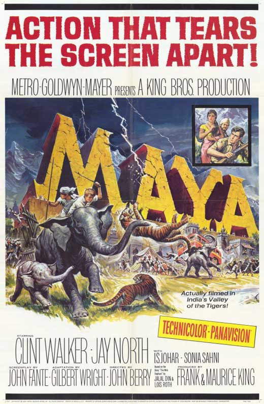 There’s a Maya in my family, and I know some other Mayas too. But that was only
the first name that jumped at me.
DC’s new logo began appearing on publications released last Wednesday, Mar. 7th.
It replaces what officially was called the DC Spin, introduced in 2005 to succeed the long-lived DC Bullet.

New websites were also unveiled for DC Comics and parent company DC Entertainment. And the DC Nation block of programming that now runs on Cartoon Network from 10 to 11 a.m. Saturdays, which debuted on Mar. 3rd, is likewise branded with — as it came to be known soon after news broke on Jan. 13th of DC’s trademark filing — the DC Peel.
I don’t love it.
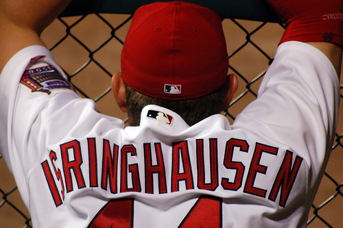 I didn’t get around to publishing this during the regular season, and the Phils’ early
exit from the playoffs left me too bitter to come anywhere near the subject of our national pastime. Since yesterday’s unnecessary behemoth of a disquisition tied a belated bow on 2011 baseball for me, however, it’s now or next year to discuss my favorite jersey accents.
We’re not talking about Joe Piscopo, Danny DeVito, or Joe Pesci here.
 Cover to Avengers #273 [digital] © 1986 and characters TM/®
Marvel Comics. Pencils, Inks: Tom Palmer (Black Knight);
John Romita (border). Colors: Unknown.
This post is currently down for maintenance.
And one woman, too.

Fabien Gonzalez has created a superhero alphabet, rendering letters from A to Z in the costumes and colors of characters both iconic and obscure. I first came across it on EW’s PopWatch blog; you can purchase a print from Gonzalez’s Flickr stream.
Google’s logo of the day is a weird one. I wish you luck clicking on it to find out what it represents...

There have been a few articles speculating on its meaning, but I suspect we won’t hear anything from official sources for a while yet.
I hadn’t tried it yet when writing about Mad Men the other day, but now that I’ve done so I cheerfully direct you to “Mad Men Yourself” on the show’s official website.
Here’s me:
 You get just enough choices at each stage that the process doesn’t become a chore yet it still manages — in my case, at least — to produce a surprising likeness. I did think it was strange, however, that options for facial hair included a full beard and a goatee but not the kind of mustache-with-goatee combo I currently sport.
The artwork for “Mad Men Yourself” was done by the designer and illustrator Dyna Moe, whose portfolio is an absolute delight. Also on the Mad Men website are a cocktail guide to era-appropriate libations, a four-minute video recap of Season Two, and a stunning photo gallery of the cast as they’ll look in Season Three [all bad links].
Given the series’ return on AMC Sunday at 10 p.m., I’m pleased to report, NBC is tonight repeating Jon Hamm’s hosting turn on Saturday Night Live, which featured “Don Draper’s Guide to Picking Up Women”.
Related: Mad Mix • Ol’ Pointy Ears Is Back • Screen Savor

