I was quite taken by the following sequence from The Uncanny X-Men #166,
dated Feb. 1983.
 Excerpt from The Uncanny X-Men #166 © 1982 and characters TM/® Marvel Comics.
Script: Chris Claremont. Pencils: Paul Smith. Inks: Bob Wiacek. Colors: Glynis
Wein/Oliver. Letters: Tom Orzechowski. Editing: Louise Jones/Simonson.
The set of five panels is at the bottom of Pg. 12 of the issue’s story, “Live Free or Die!”, drawn by Paul Smith in his second issue as penciler of the series.
If you’re unfamiliar with the issue and would like some context, you can head over to my friend Teebore’s post on it — the reason I was rereading the issue in the first place. What I have to say about the panels below is taken from comments I made there, but I thought I’d repost the passage here even though I’m on a bit of a vacation. It seems fitting to be publishing this analysis online from the same library where I did my first historical and critical reading about comics as a kid 35 years ago.
What follows was taken out of a post from last month due to technical problems.

I paused at the above panel of Wolverine when reading along for the methodical
X-Men examinations done by Austin Gorton under the nom du blog Teebore. Source
is The Uncanny X-Men #147, whose battle between Doctor Doom and Marvel's merry mutants (or so Smilin' Stan Lee often called them; they're actually infamously angst-ridden) was underwhelming to many readers, as reflected in Teebore's assessment of that issue and the follow-up comments.
The nice panel composition and set dressing aside, I'm really keen on the way the character's face and smoldering chest are recessed in shadow, although I don't know how much to credit recently returned penciler Dave Cockrum. While pencilers tend to mark off areas of solid black even when they're only roughing out art for an inker to embellish, Josef Rubinstein could have a heavy hand in that role. More curious to me is how little the figure work resembles Cockrum's, because Wolverine is usually depicted in the comics as about a foot shorter than his silver-screen vessel Hugh Jackman — whereas in this panel and the preceding one, unlike the rest of the issue, he's clearly musclebound but lankier and longer-limbed than his usual stocky, compact self, akin
to how Brent Anderson drew him.
I noted on Sunday that my pal Teebore’s methodical march through Marvel’s X-Men over at Gentlemen of Leisure has reached Oct. 1976’s X-Men #101 and the start of the Phoenix saga.
 Front of cover to Phoenix #1 © 1984 Marvel Comics. Pencils: John
Byrne. Inks: Terry Austin. Letters: Jack Morelli. Colors: Unknown.
Well, I’ve been organizing material from throughout my career as a comics journalist for archiving at another website and I just happened to come across some items related to that epic.
My friend Austin Gorton, who blogs (and comments here) under the handle Teebore, has been methodically examining Marvel’s X-Men in a series of posts over at Gentlemen of Leisure. He began with 1963’s X-Men #1 and last week reached #101, a landmark for more than just its numbering as Jean Grey evolved into Phoenix. But the entry that I’d most been waiting for is the one on X-Men #98.
 Cover to X-Men #98 [digital] © 1976 and elements TM/® Marvel Comics.
Pencils, Inks: Dave Cockrum. Letters: Dan Crespi. Colors: Unknown.
The issue is a sort of touchstone for me.
For my 40th birthday I thought I’d share a few musings on favorite things.
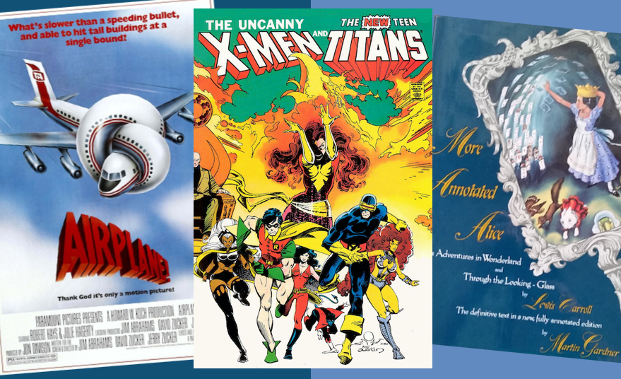
Not wanting to get mired in a swampland of categories or graphics nor too much internal debate, I settled on a casual catch-all catalog of whatever popped into my head. The items have been jotted down and put in rough order; now they’re being written up in varying levels of detail as time permits.
Of course such “things” as my nieces and nephews are indescribably precious to me,
but while I share the occasional story about them here I wanted to keep these posts focused on pop-cultural diversions.
![Chris Claremont Bingo card with boxed marked: angst; 'Magick(s)'; noble villain; Scott loses visor/glasses; 'Bub'; 'Tovarisch'; 'yah'; 'Sugah'; wordsmush precioustalk; angst; 'I hope -- I pray'; angst; X (free space) [middle]; 'most secret self'; time-tossed character; 'best there is'; 'Her power is a song within her'; angst; 'ultimate expression'; *snikt*; 'nigh-invulnerable'; aviation specs; 'Mein Freund'; angst; fastball special](https://blogger.googleusercontent.com/img/b/R29vZ2xl/AVvXsEhNv9wENaZhOmxF47C8S8z5ejB-bUBK6DKEKfP0YLbaimuyTgnbYScWvKvbMt_p12ak0jrTC-gWlI7_c_fN_AfxCmt46HCmszz-7MmGeThywRrrXS_11LKT8e1cXlgB000oFstx4wdq2X7Q/s1600/ClaremontBingo-Color.jpg "Sadly, Bingo is *not* Magneto's younger brother with the power to control Bing Crosby")

