
I really need to write about Fringe more often. A couple of friends have been urging me to do periodic if not weekly reviews, but that’s almost certainly not in the cards. While I’m hoping to publish at least some thoughts about what’s happened on the show since my first major post on it this time last year, soon, right now I just want to finally clear my metaphorical desk of several images that have been on the docket to share for nearly that long.

The week after I finally got that piece up, Fox aired one of Fringe’s best episodes — confirming Peter Bishop’s origins and blowing the show’s mythology wide open. “Peter” was a flashback to 1985, with awesomely retro opening credits; it showed the Walter Bishop of the standard Fringe universe spying upon the denizens of a parallel universe whose history and technology were slightly divergent from the familiar but which was inhabited largely by close counterparts of Fringe’s Earth. Later in the season Peter Bishop returned to the alternate universe in the present day, and in Part Two of May’s season finale “Over There” we saw some intriguing framed comic-book covers in his room.
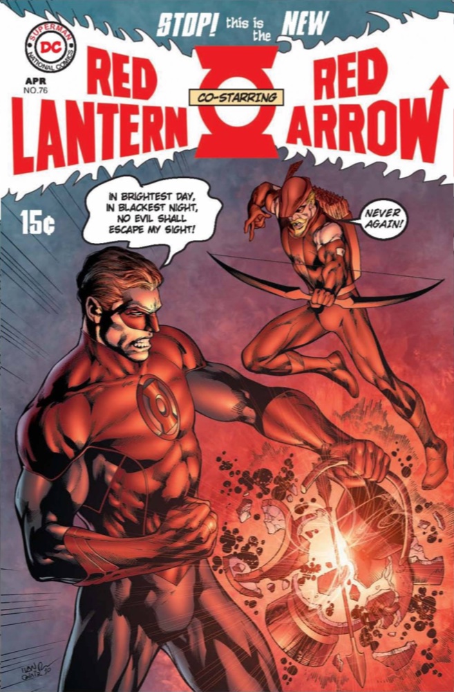
Most prominent among the covers was the reversal above left of Neal Adams’ iconic (among comics buffs) cover to Apr. 1970’s Green Lantern #76. The DC series was known at the time as Green Lantern / Green Arrow due to the twin billing in the logo, and its transposal to Red Lantern / Red Arrow is a perfect choice to represent the small yet significant differences between the dual dimensions.
Geoff Johns wrote in a blogpost for The Source the day after the episode ran that
“Over There” co-writer/director and Fringe producer Akiva Goldsman had called up Johns (DC’s recently minted Chief Creative Officer) to see if DC — a corporate sibling of the show’s production company, Warner Bros., that has also published Fringe tie-in comic books — would mock up some appropriate alternate versions of classic covers. I’d originally planned to simply point you in the direction of Johns’ post for the remaining covers, as it links to large, pristine images, but now I’m thinking that running small copies of each next to the original covers on which they riff might be edifying for the non-comics folks who read this. All scans of the original covers are copies of those uploaded to The Grand Comics Database.
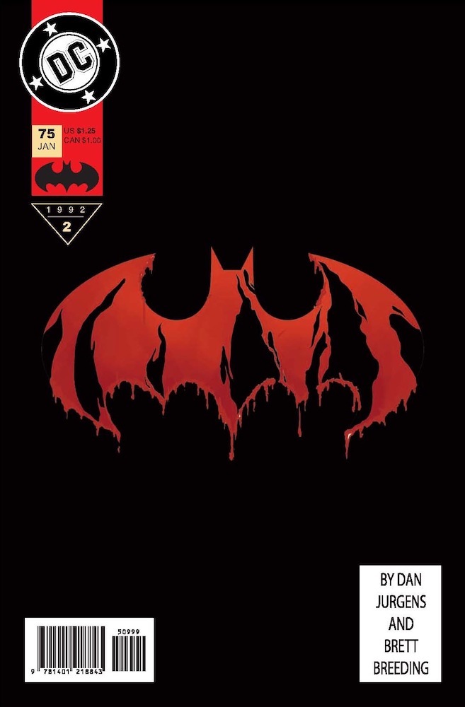
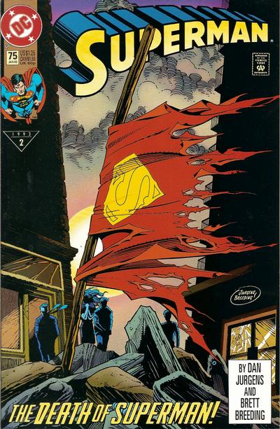
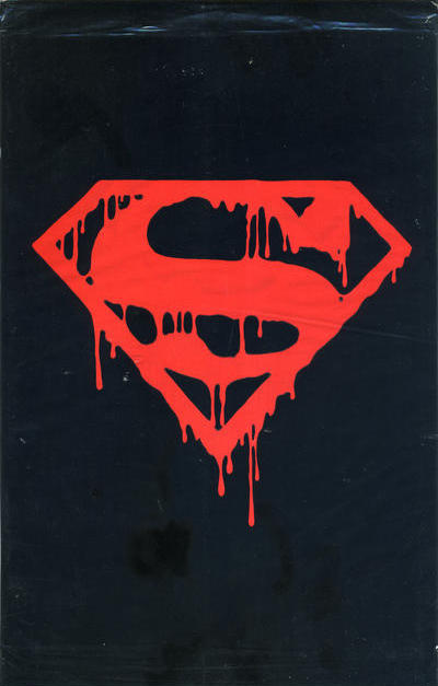
First up alphabetically is the alternate universe’s Batman #75, which in at least one regard is the biggest anomaly. It riffs on the infamous Superman #75, dated Jan. 1993 — the issue in which Superman supposedly died (actually the second comic book numbered Superman #75, since in 1986 the first series was retitled The Adventures of Superman during a relaunch). Superman #75 was released in both a standard edition, with Superman’s tattered cape marking the spot where he fell battling Doomsday, and in a special edition with a memorial cover designed as a gravestone that came sealed in a polybag sporting a bleeding ’S’ shield set against a black background. The Batman #75 mockup uses the polybag’s motif but with trade-dress elements included as though it were the physical cover to the issue, so perhaps Fringe’s alternate universe didn’t have our 1990s obsession with gimmickry.
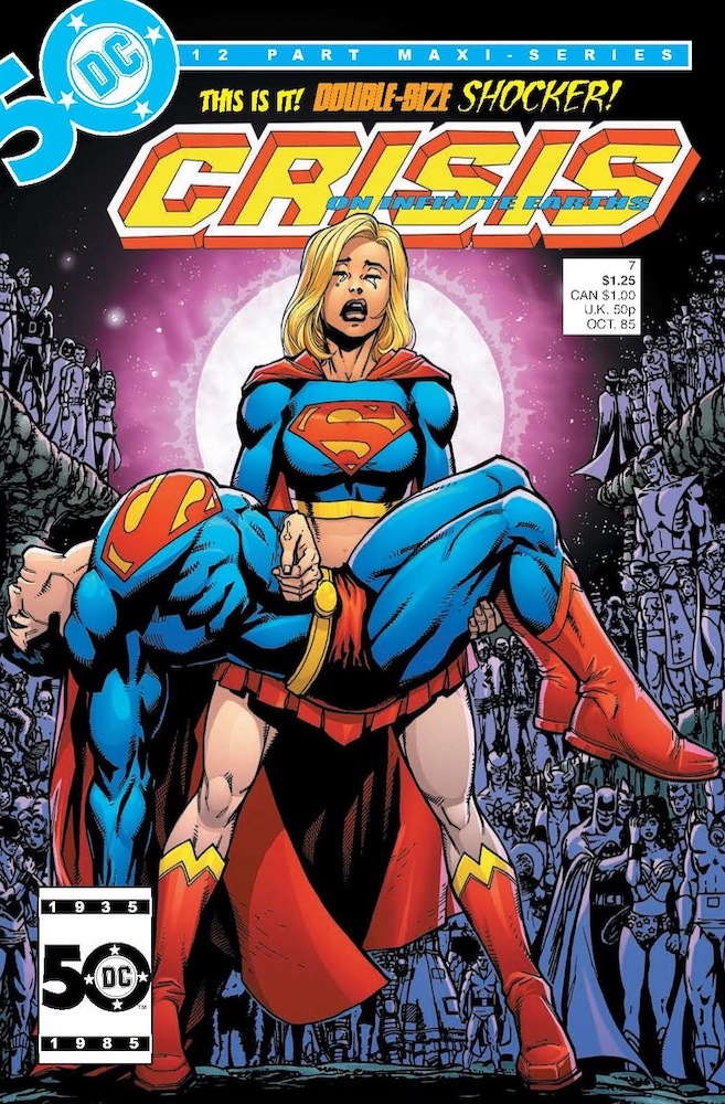

Next is Oct. 1985’s Crisis on Infinite Earths #7, which in our universe — you might sense a morbid theme, but landmark stories often deal in tragedy — killed Supergirl. While all of the logos and lettering have been redone almost exactly, it appears that George Pérez’s background figures were kept from the original, with only Supergirl and Superman in their pose echoing Michelangelo’s Pietà redrawn; curiously, the outfit worn by Supergirl is most like the one she currently wears (similar to her first, but with a bare midriff), rather than the one with a different cape design and widely derided headband the character wore in 1985. As superhero-comics aficionados know, the 12-issue Crisis was the first in a succession of housecleanings undertaken by DC to straighten out its proliferation of parallel universes, giving the usage of an issue in
this context some added piquancy.
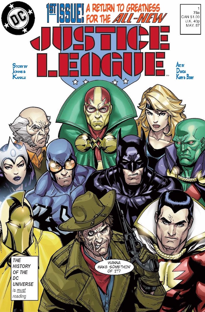
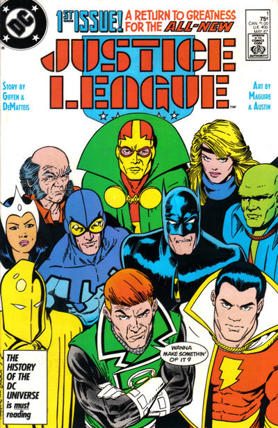
The strangest cover of the bunch, to me, is the alternate-universe version of Justice League #1, dated May 1987. Although its notability isn’t in question — like the cover of Crisis on Infinite Earths #7, it’s one of the most frequently aped covers of its decade — the only difference beyond style between the Fringe mockup and the original, penciled by Kevin Maguire and inked by Terry Austin, is that Guy Gardner, prodigal Green Lantern, has been replaced by Jonah Hex. Batman hasn’t been replaced by Superman, The Martian Manhunter isn’t red-skinned instead of green, neither Blue Beetle nor Black Canary have had their costume colors altered, Captain Marvel hasn’t been switched for his sister, Oberon isn’t a woman presumably named Titania, nada.
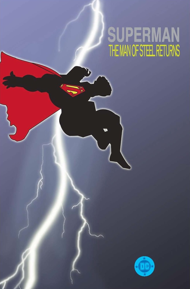
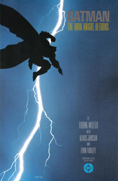
Finally we come to what’s presumably Book One of Superman: The Man of Steel. In contrast to Batman #75, it’s missing elements of trade dress (namely credits, issue, and price information) that are found on its real-world counterpart, Book One of the watershed limited series Batman: The Dark Knight — popularly known as The Dark Knight Returns thanks to the usage of the first chapter’s title on the cover of the first issue, which gave its name to subsequent collected editions. Fringe’s mockup appears to set actual interior Frank Miller art of Superman from Dark Knight in silhouette against a close facsimile of Lynn Varley’s lightning strike.
I don’t recall how much if any detail we got on the situation in the episode, but I find it curious that whomever set up Peter Bishop’s apartment in the alternate universe used, with the exception of the 1970 Red Lantern / Red Arrow issue (and possibly Crisis on Infinite Earths #7), comic books that would all have been published after his abduction in 1985. There are comprehensive rundowns of differences between Fringe’s main and parallel universes at both Fringepedia and the Fringe Bloggers website [bad links]; I haven’t read them in great detail, but you’re more than welcome to bring up some intriguing trivia in Comments.
Logos and characters TM/® DC Comics.
Cover to Green Lantern #76 © 1970 DC Comics. Pencils, Inks: Neal Adams. Colors: Jack Adler. Letters: Gaspar Saladino. Script: Unknown.
Cover and polybag of Superman #75 © 1992 DC Comics. Pencils: Dan Jurgens. Inks, Colors: Brett Breeding. insignia: Eric Kachelhofer.
Cover to Crisis on Infinite Earths #7 © 1985 DC Comics. Pencils, Inks: George Pérez. Colors: Tom Ziuko. Letters: Gaspar Saladino.
Cover to Justice League #1 © 1987 DC Comics. Pencils: Kevin Maguire. Inks: Terry Austin. Colors: Bob Sharen.
Letters: Gaspar Saladino, Todd Klein.
Cover to Batman: The Dark Knight #1 © 1986 DC Comics. Pencils, Inks: Frank Miller. Colors: Lynn Varley.
Mockups © 2011 DC Comics. Illustration, Design: Ivan Reis, Oclair Albert, Larry Berry, Carlos D’Anda, J.J. Kirby, Michael Lopez, Oliver Nome, Ed Roeder, et al.
Related: 50 Four • Iconocrypt • Who’s Zoomin’
Who • Woman on the Verge • Force Clicks
They also sucked any non-white ethnicity out of the lady with the awesome white tiara on the left hand side of the Justice League pic. Everyone seems paler in the new one, to be sure, but she appears to have changed races.
ReplyDelete
ReplyDeleteYou're right. She's the "new" Doctor Light (civilian name: Kimiyo Hoshi) — actually, she dates to Crisis, but DC never did enough with her. The original Doctor Light, introduced in 1962, was a very powerful but largely ineffectual villain whose incompetence became a bit of a running joke, prompting the powers that be to first give his name and costume to a superhero in 1986 — featuring her in the Justice League relaunch in 1987 — and then in 2004 allow him to revealed as a sadistic rapist (you'd think that such a phrase would be redundant, but it's applicable) who basically was given a magical partial lobotomy. While it was nice to have the new Doctor Light be female and Japanese in the name of increased diversity (for realism's sake if nothing else), she was often portrayed not just as a single-mom workoholic who neglected her kids in favor of her career or Justice League duties, which might have been meaty plot strands had they been picked up with any dimension, but as an outright shrew. Naturally when she confronted the animated corpse of the original Doctor Light last year, her costume was stripped to tatters and she ended up fighting him nude, which always seems to happen to the gals but not so much the dudes.
ReplyDeletePS: I love that My Little Joanie actually typed the words "Justice League" — even if you henceforth refer to Doctor Light as "Awesome-White-Tiara Lady" (cf. "Orbo").
@Blam: I love that My Little Joanie actually typed the words "Justice League" — even if you henceforth refer to Doctor Light as "Awesome-White-Tiara Lady" (cf. "Orbo")
ReplyDeleteHa! She's becoming one of us!
I really need to watch Fringe. So much TV (and movies, and comics, and books...), so little time.
she dates to Crisis, but DC never did enough with her.
Indeed. Even re-reading Crisis and those early Justice League issues nowadays, she seems poised to make the jump to the big time, yet never really does.
Interesting that the alt-Justice League cover is only changed by the Jonah Hex/Guy Gardner swap. Maybe their Crisis brought their status quo closer to ours. ;)
Holy Smokes, I can't believe I just exposed my Secret Identity to the world like that! You're slipping, Joan! Thankfully only you and Teebore are able to see it. I would hate to have everyone know that my real name is Maudrianna Eunice Tuttle.
ReplyDeleteYou know I actually had to cut and paste "Justice League"? I knew when I read it that I would never remember it and I would call it something goofy like "Oddly Colored Tough-Guy Club".
even if you henceforth refer to Doctor Light as "Awesome-White-Tiara Lady" (cf. "Orbo").
Hehe, I actually refer to her as "Bianca Eyebrows" in my head.
The covers were definitely a cool touch, but I was kinda surprised that they didn't try to match art styles better on some of them and just disappointed by how ugly the Crisis and Justice League ones were.
ReplyDeleteI really need to write about Fringe more than annually. A couple of friends have been urging me to do periodic if not weekly reviews, but that's almost certainly not in the cards.
Please? You at least do have to give us another actual review.
which might have been meaty plot strands had they been picked up with any dimension, but as an outright shrew. Naturally when she confronted the animated corpse of the original Doctor Light last year, her costume was stripped to tatters
ReplyDeleteMeaty Plot Strands is my new band name. No, wait: Outright Shrew! Either that or Stripped to Tatters.
(I say steal from the best!)